
HomePlate Youth Services
Brief — Develop a new brand and content that gives staff the tools to communicate clearly with program participants and the broader community
R O L E
Project Lead
S K I L L S
Brand Strategy
Logo Design
Print Media
D A T E
January 2021 - November 2021
T E A M
Jess Leftault (Designer)
HomePlate Youth Services Staff & Participants
Context
In December of 2020, HomePlate Youth Services hired a new Director of Development, Marie Piayai, who recognized pretty quickly that she didn’t have the professional marketing materials she needed to fundraise and engage with donors.
Heading in to the second year of the pandemic, another endeavor began for this nonprofit; they started fundraising to purchase and renovate a new building for their programs. The capital campaign for a new building and more robust housing options for their youth became integral to their rebrand.

Questions
Who are HomePlate’s primary constituents and who aren’t they reaching that they need to?
How can our brand be used to reframe common misconceptions about houselessness and housing instability among youth?
Does the brand currently communicate our radical approach to creating stability at a critical time in a young person’s life?
Meeting Youth
Where They Are
The process began with an all staff of 15 meeting to define HomePlate’s needs and educate me on my own preconceived notions of the causes of housing instability and how white patriarchal supremacy impacts the structures HomePlate’s Youth are constantly navigating.
The biggest take away from this meeting was that HomePlate was doing homeless services in a more radical way. Their specialty was building trust with their constituents through community-based organizing and engagement. They were always simply meeting youth, literally and figuratively, where they are.
Get to Know HomePlate


Elevate the Voices of Youth
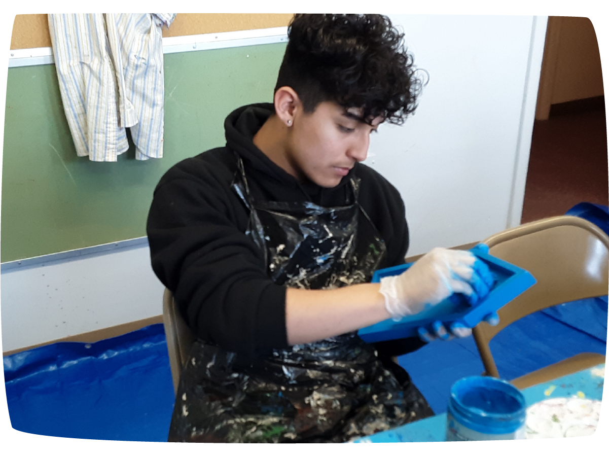
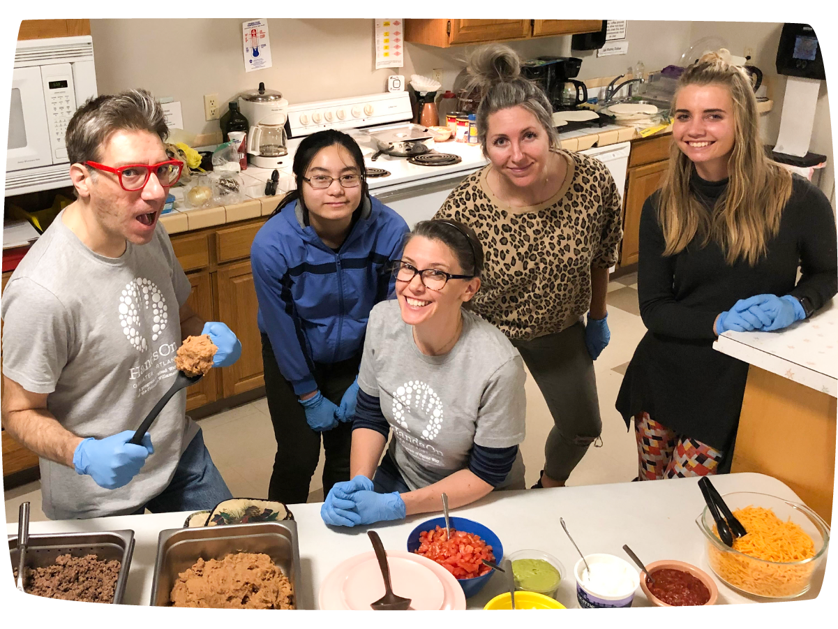
HomePlate doesn’t keep a roster of the individuals they work with. Anonymity is crucial to gaining the trust of the people they help. Many of the youth they serve visit their program daily to receive nutrition, a shower, free laundry, and anything else they may need to stay safe while living in unstable housing situations.
We established two ways to involve the youth in the process without risking their anonymity or safety. Using a series of surveys and interviews, I got to know some of the youth and saw with my own eyes how much HomePlate was providing them.
During the course of my work with HomePlate, I visited their facility on 5 separate occasions to meet the youth and determine how they viewed the help and guidance they get from HomePlate.

Logo Design
From our conversations, I began ideation on a new logo for the organization. We came up with a first round to share with youth and staff. After collecting data, it was clear we hadn’t quite nailed the look they were going for. While reviewing inspiration, it became clear that we needed to loosen up the overall feel of everything the organization produced.

Typography
While we landed on a font to use throughout the brand pretty early in the process, we began discussing using a custom typeface for the wordmark itself. I built simple letter forms that could stack monospace on top of each other.
The stylize type brought a unique character to the wordmark and paired well with the simple geometric sans serif, aptly called Hero New.

Color
Color became a very carefully consider element of the overall brand because color can be triggering to many of the youth they work with who have experienced severe trauma in their lives.
Color can be very overwhelming if you have experienced certain traumas or live with any sensory processing issues. With a new physical space on the horizon, we wanted to approach the palette through a trauma informed lens.


Applying the Brand
Communicating directly with youth of HomePlate is paramount to building trusting relationships with individuals that have rarely been given good reason to trust any adult. Having the tools to communicate directly with youth from varying educational, financial, and multilingual backgrounds became our main focus.
Iconography
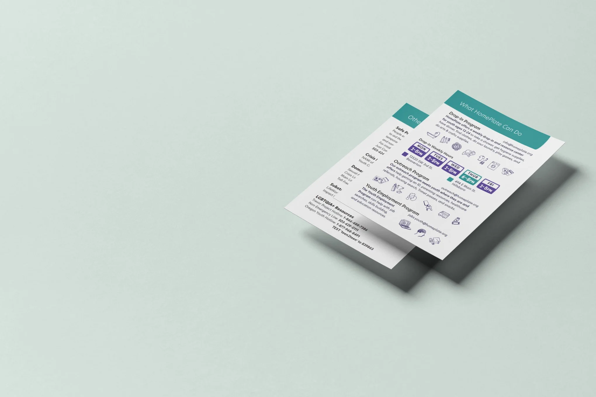
We developed a thorough set of icons that covered all aspects of the services they offer so that anyone they came across could have a simple sense of what is available to them.
Having a library of icons to pull from helped address any literacy or language barriers that staff might come across while working to build trust with new participants.
Print Collateral
We designed out new business cards that offered staff different ways to communication with youth depending on their needs. Staff could choose from one of three designs depending on the most effective ways for them to talk with the youth they served specifically.
Information cards with everything a potential participant may need to understand what is available to them became a crucial tool of the street outreach programs.
Capital Campaign
Along with the essential pieces of any brand, we simultaneously designed content for HomePlate’s ongoing capital campaign.
While raising millions for a new building to house their program, Marie made it clear that we would need several communication pieces to reach potential donors.
Answers
Using interviews with staff and youth, we prioritized communication with youth while being conscious of the content needed to reach donors and supporters.
We developed informational content for potential donors that informs without judgment. This helps tackle many preconceived notions we have about housing instability for those under the age of 18.
Developing icons and print media to clearly communicate across language and literacy barriers so that trust can be built with potential participants and lasting relationships can be established.